
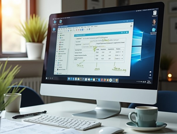
Anyone who has stared at a wall of text trying to find a settings button knows the problem. Software instructions written as pure prose ask readers to translate words into actions, and that translation step is where confusion creeps in. Annotated screenshots skip the translation entirely; they show users exactly where to click.
The Gap Between Reading and Doing
There’s a real difference between reading “select the export icon in the toolbar” and actually seeing an arrow pointing at that icon. A study from the University of Bayreuth found that 58% of participants preferred image-based instructions over text or diagrams when learning new tasks.
Those who followed pictorial guidance performed better on the resulting exercises. That’s not a small preference gap. It suggests how people process interfaces: visually, not verbally.
Where Complexity Breaks Written Guides
Software interfaces change. Buttons move, menus get renamed and new panels appear after an update. Written guides age quietly. This is where technical documentation software earns its keep. This is because it lets writers capture the actual interface rather than describe it from memory.
A few common failure points show up again and again:
- Instructions reference a menu item that’s since been relocated
- Screenshots are pasted in manually and never get updated after a release
- Steps assume prior knowledge the reader doesn’t have
- Long paragraphs bury the one detail that actually matters
How Teams Usually Solve This
Most product and support teams try a mix of approaches before settling on something sustainable. Some rely on video walkthroughs, others build internal wikis, and many eventually turn to purpose-built technical documentation software.
The appeal is straightforward: annotated screenshots reduce ambiguity, and structured topics keep everything organised as the product evolves. Businesses that document this way tend to see fewer repeat support calls, simply because users can see the answer rather than guess at it.
Role of Dr.Explain
This is the exact gap Dr.Explain was built to close. It captures live UI elements, auto-detects controls like buttons and fields, and lets writers annotate directly on the screenshot. Topics stay organised in a structured project. Moreover, the same source publishes to web help, PDF, and CHM.
Teams juggling frequent releases find this particularly useful. This is because updating one topic after a UI change is far quicker than rewriting a whole manual.
Annotation as a Reading Aid, Not Decoration
Good annotation isn’t about making a screenshot look busy. A well-placed callout, arrow, or highlighted field does one job: it removes the guesswork from “where exactly do I click?” That’s a small thing on any single screen. However, across a full onboarding guide or a technical manual, it adds up to real time saved for the reader.
Bringing Structure and Visuals Together
Annotated screenshots work best when they sit inside a properly structured guide, not scattered across a document. Dr.Explain pairs its screenshot annotation tools with topic hierarchies, review statuses, and multi-format publishing. It ensures teams get a maintainable documentation workflow.
Final Thought
Complex software doesn’t need complex instructions. It needs guides that show, not just tell, and screenshot annotation is how you get there. Pair that with structured documentation, and users stop guessing, and support teams stop repeating themselves.
